Void Grimm Clicker
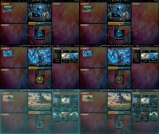
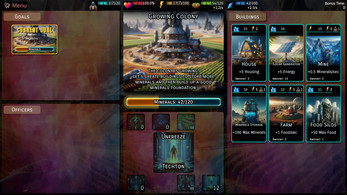
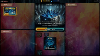
Void Grimm Clicker is an idle / clicker game in which you manage a scifi colony. This is a very early prototype and has only around 20 minutes of gameplay. I want to grow this game, but right now it is a proof-of-concept to test out UI, effects and gameplay elements, so I'd love to hear your feedback.
My goal is to create an idle game which combines colony management and story telling in a scifi setting.
Join my Discord:
Void Grimm Clicker is set in the same universe as Void Grimm, the main game that I'm developing. Check it out here:
https://store.steampowered.com/app/1789360/Void_Grimm/
I want to publish a Steam version of Void Grimm Clicker in the future, so wishlist it here:
https://store.steampowered.com/app/3327900/Void_Grimm_Clicker/
Tips:
- If you are stuck at the minerals quest, try the other goal first. Maybe you'll find there something that you need.
- Techtons require food. Morale slowly falls to 10%, if they have not enough food and will slowly grow to 100%, if there is enough food.
- Meditation raises morale but the higher the morale is, the faster it will fall, so you can't raise it forever.
Note:
This version is an early prototype to test general gameplay. Balancing will definitely change and I will add more buildings, researches, upgrades and officers, but I did not have time to include them yet. I also want to add a prestige system. Let me know, what kind of features you think I should add.
| Status | Prototype |
| Platforms | HTML5 |
| Rating | Rated 3.8 out of 5 stars (4 total ratings) |
| Author | Ravery (Ravery.net) |
| Genre | Strategy |
| Made with | Unity |
| Tags | Clicker, colony, Idle, Incremental, Management, Sci-fi |
| Links | Steam |
Comments
Log in with itch.io to leave a comment.
Nice idea, reminded me very much of Crank. Still has a huge way to go, obviously, but nice start. But using the redhead on the title without her being in the actual game is a bit of a scam... :P
Thanks! I actually don't know Crank. Do you have a link?
The redhead and a few others will be delivered next update.
https://faedine.com/games/crank/b39/
Cool game! Thanks for sharing.
I really enjoyed it and was surprised by its quick ending after half the time you stated. :-)
Thanks!
I took the average of an active playstyle and idle playstyle, which gave me 20 minutes. Next update will have more content.
I like the concept, it’s nice to have that 12 minute (how long it says it took me) play to that point. I did have a little difficulty with the UI/UX to start with. I didn’t sort out where to click to gather stuff.
You are not the only one, who got confused at first. I have to figure out how to improve it. I'm glad you liked it otherwise.
To me, it was thinking the “goals” would progress when clicked on. I’m not sure if it’s a layout that might change how that works. Or if a popup or even slight notification, to indicate why it looks like it’s “trying to do something, but failing”. I hope this can help understand where you might want to take that aspect. It felt, “it looks like it’s doing something, but not working for me,” and I’m glad I explored more to find it.
I’ve been playing Syberia a point and click adventure… There’s a lot of, “If that’s going to work, it looks like I need something different,” type internal dialogue.
Great game, cant wait for more :)
Thanks! I'm already working on an update.
It is a really good prototype. It is fun and engaging. It blends manual and automated resource generation nicely. It even has a hint of the story. Keep it going. I would polish some of the UI as there are graphical artifacts present. Keeping the buildings as a list is really inconvenient so I would just focus on improving UX. Goodluck!
Thanks for the feedback! I'm not quite sure what you mean with graphical artifacts and "Keeping the buildings as a list is really inconvenient".
Ok, I thought it was an artifact (a glitch/badly cropped or in some other way malformed graphic) but it is just a design choice. I would go with a plain background for the progress bar because that thin black line looks like there is something wrong with it: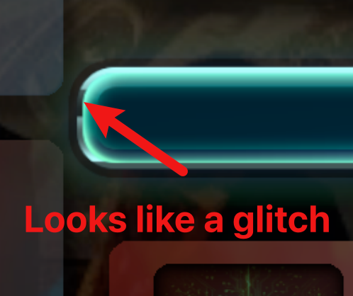 Also when the progress bar fills up the glow is just cut abruptly and that is not how glow behaves. So just a small things basically.
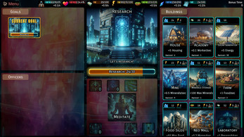
The buildings are rectangular cards that are higher than wider. And they are stacked in a vertical scrolling group. So there is a lot of scrolling up and down which is annoying. I would arrange the buildings at the bottom and make them scroll horizontally (that way you could see way more buildings). Maybe give them separate tabs to eliminate scrolling altogeather. That still leaves plenty of space on the sides for smaller buttons.
It is about using space. You have small clickable elements in a containers that take a lot of space and big clickable elements in a containers that occupy relatively small amount of space. The first bunch leaves a lot of your UI kinda empty while the second one makes it cramped. That is why I think that your game would really benefit from a better arrangement of the UI elements - both visually and in terms of UX.
I'll update the glow and I'll think about how to improve the bar.
I agree with the scrolling and I will introduce tab groups next update. The current "Building" tab is basically a "all buildings" tab and unlocking research will show category tabs e.g. "Research" tab that shows the research buildings and the available techs.
But I do like the "arrange the buildings at the bottom and make them scroll horizontally" idea. Especially as it would be very similar to Void Grimm (where the cards are arranged horizontally at the bottom of the screen as well).
Thank you very much for the in-depth feedback!
Please keep in mind that it's an early prototype, but I wanted to hear feedback as early as possible, so let me know what you think.